IntroancoreShare is added as a user-friendly button on your Qlik sheet, and you can define the properties to configure the appearance of this button. As the users can use this button to generate and share reports, you can customize it to reflect what it is meant for. You can add a text caption with icons, change the button color, and add a tooltip. For example, you can set the caption as the name of the report it generates, or use icons to indicate the purpose. The caption is highly customizable and super flexible, as you can use HTML. Here's an example showing various buttons created using ancoreShare settings.
| 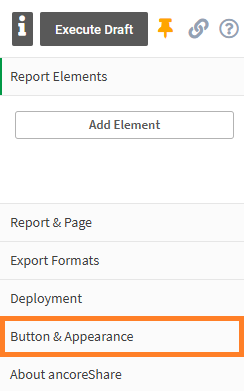 |
Appearance SettingsTo configure the appearance of the ancoreShare button, perform the following steps.
| 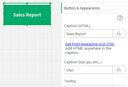 |
CaptionThe caption helps the users identify the purpose of the button. You can provide a text Caption or use HTML code for designing it the way you like. | |
The easiest way to add a custom icon to your caption is by using the Font Awesome icons. As the font awesome library is embedded into the ancoreShare installation, it also works offline. You will not need internet access to display a button with these icons. To access the Font Awesome website to browse for icons, click the Get Font Awesome icon CSS. This opens the website in a new browser tab. Select the icon of your choice and copy the HTML code. Here's a sample code that we used: Caption SizeSpecify the Caption Size in px, em, pc, pt, or any other HTML supported units.Remember that you must provide the unit along with the numeric value. TooltipA tooltip allows you to define a text that will be displayed when hovering over the button. Here, you can provide information, such as a description of the button's function or any additional details. In the edit mode, by default, the tooltip always shows the Qlik Sense object ID of the button instance. The actual tooltip that you specify here is only visible in the view mode on the Sense sheet. See the example in the image | .png) |
Colors and DesignUse the buttons provided to choose a preset style for the ancoreShare button. The look of the button is defined by a CSS file named npqreportsButton.css* that is available in the ancoreShare Extension directory inside the folder css. The default file contains eight different styles (classes) for the preset button styles available here. When you select a default style, the CSS class corresponding to it is displayed. You can further change the design or use your custom styles for the button too. For this, create a new CSS class inside the npqreportsButton.css* file. You can then provide the name of this new class in the CSS Class field. *Although we re-branded the product name to ancoreShare, we chose to stay downwards compatible in respect of our long-time users. Hence the CSS file will continue to be "npqreportsButton.css." | 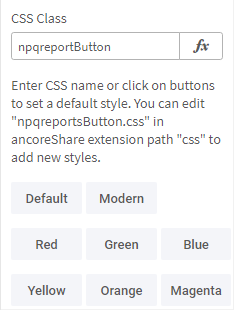 |
GeneralThis is a default feature by Qlik Sense and is available by default in all visualizations except filter panes and text and image visualizations, and is typically not applicable for the ancoreShare button. The available options are:
| .png) |
Alternate stateThis is also a default Qlik Sense feature for all visualizations. From the Alternate States, choose any state defined in the master items.
| .png) |
.png)
Next Steps:
- Define the activation condition
- Or proceed with Page Settings to set the look and feel of the report
- Then, add and configure report elements to create content for the report