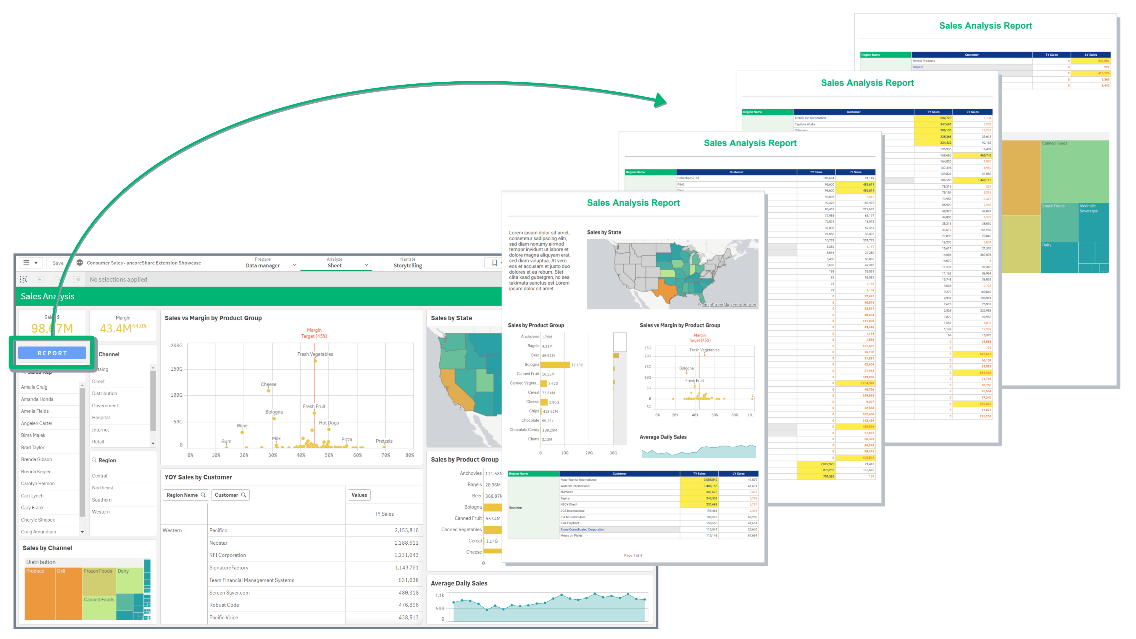
Intro
The Positioning and Sizing Elements article is essential for learning how to create and design reports in ancoreShare. Thanks to smart presets, you can quickly create on-the-fly reports with minimal setup. For more detailed needs, ancoreShare offers comprehensive, flexible settings across all elements, enabling you to compose pixel-perfect reports with ease as well.
This article covers essential settings—like anchoring, spacing, and sizing—and demonstrates how to combine these and other positioning options to bring any design vision to life. Learn how to configure each setting to achieve the exact layout you envision, whether creating headers, footers, or a cover page.
For details on adding and configuring a table of contents (TOC), see the TOC Element article. If working with elements in a cycle section, refer to Positioning elements within a Cycle.
General
By default, all elements in ancoreShare are arranged from top to bottom, left-aligned on the page.
- Qlik Object Elements (charts, visualizations, tables, etc.): By default, these elements maintain their original aspect ratio based on the size of their respective Qlik visualization objects in the app sheet, based on the "Automatic" size type.
- Qlik Sheet Element: The sheet element will always fill a whole report page.
- ancoreShare Elements (line, text, page numbers, table of content, etc.): These elements default to 100% page width.
The images below demonstrate default positioning on a sample report preview, using only the default presets for size and position of elements. A border and font size for the text element have been adjusted for visual clarity.
Design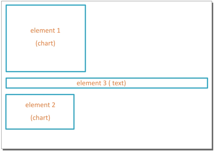 | Report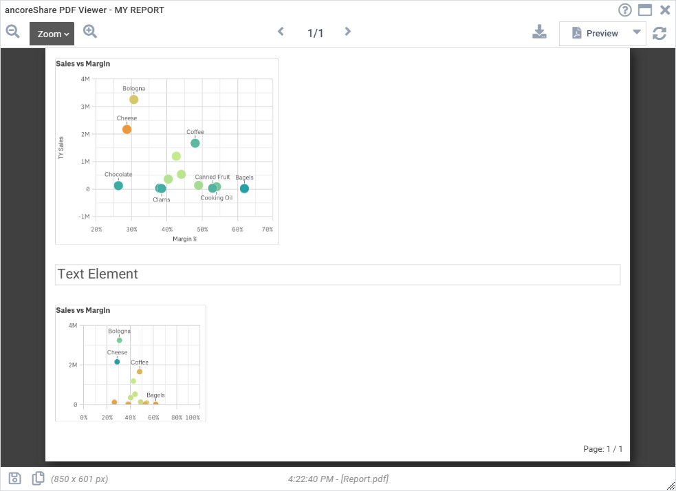 |
| As a designer, you can precisely position each element by combining the key settings Anchor, Size, and Spacing. | 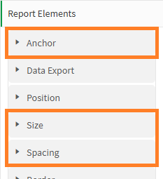 |
| In addition to these primary settings, several other options influence element positioning: Body/Header, Place Element on New Page, horizontal Alignment, and Rotation. | 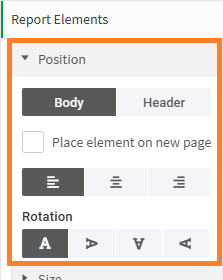 |
As those are the key settings when composing a report with objects and elements, you can already adjust those properties when adding a Qlik object to the report. This enhances the workflow and makes designing faster and easier.
The following sections guide you through each setting in detail, helping you understand how they affect element positioning on your report. At the end of this article, you’ll find design examples that demonstrate these settings in action, showing how to combine them effectively.
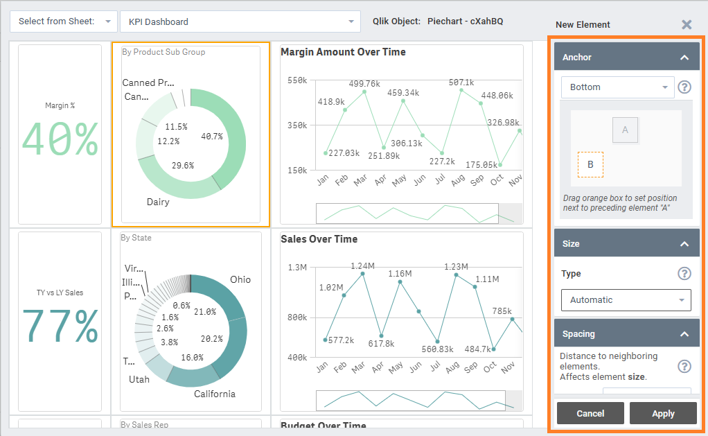
Anchor
The anchor setting defines an element’s relative position to the preceding element on the report page.
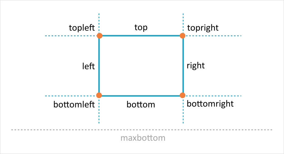
By default, elements are anchored to the bottom, placing each one below the previous element and aligning them to the left. Each element can anchor to a specific reference point (top-left, top-right, bottom-left, bottom-right) or a reference line (top, left, right, bottom, and max bottom) of the preceding element, as shown in the image below.
For the first element, the anchor is automatically set relative to the top-left corner of the page. Anchor settings become available starting with the second element, based on the order of segments in the properties panel. Once anchored, further adjustments in position can be made using the Spacing property.
Here’s an image showing the various anchor positions:
The following images demonstrate how an element (the bar chart) is positioned directly to the right of its preceding element (the tree map visualization) by setting the anchor to top-right. The image on the right displays a PDF preview of the report as it appears in the Preview Window:
Design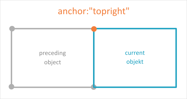 | Report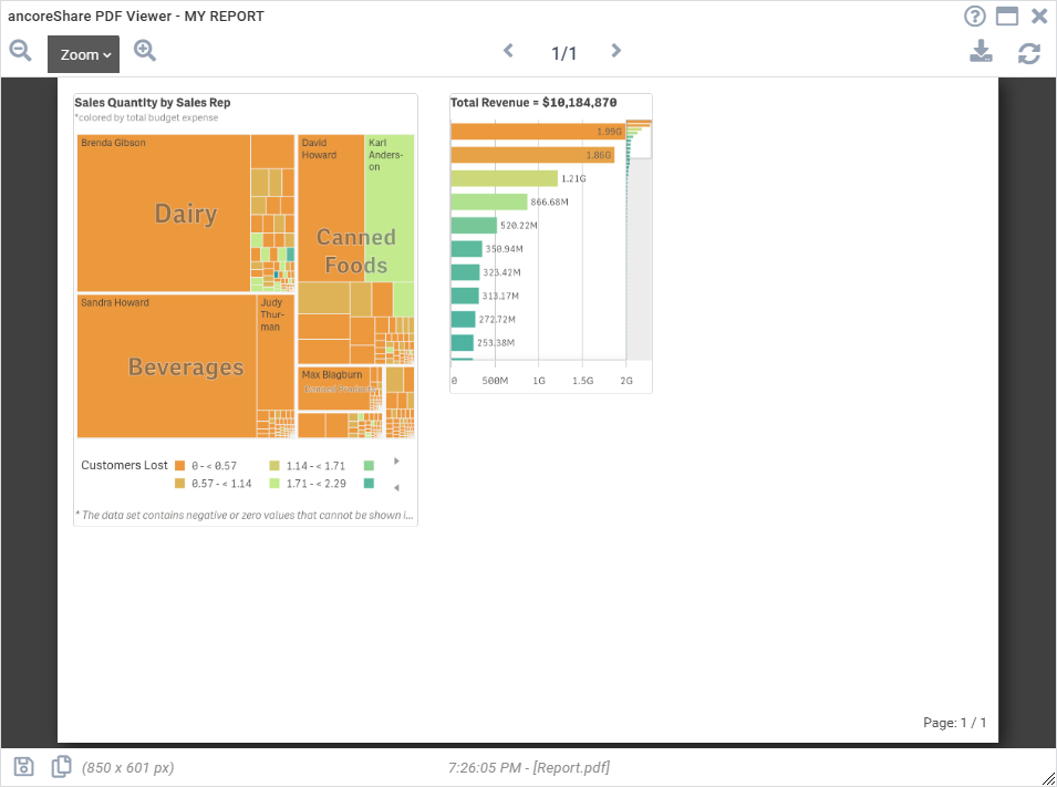 |
Max bottom anchor
The Max Bottom anchor is unique in that it considers all preceding elements on the page, not just the immediately prior one. Use Max Bottom to place an element below all previously added elements, ensuring it aligns beneath the lowest element.
To place an element beneath all other preceding elements, use the anchor position as Max Bottom.
Design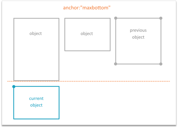 | Report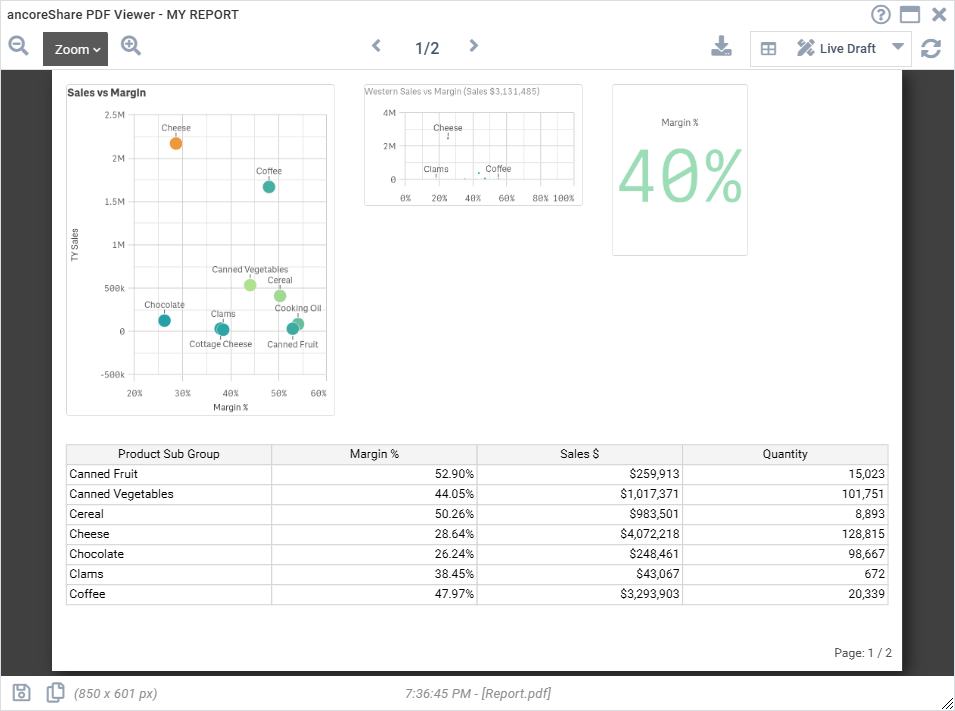 |
Anchor on Page
The "Page" anchor allows an element to be anchored directly to the top-left corner of the page instead of the preceding element. This enables free placement on the page using margins, by setting the size type to Numeric and adjusting the Spacing values. This setting is useful for positioning elements independently of the flow of preceding elements.
Exclude from Anchor List
The "Exclude from anchor-list" option allows you to bypass an element when determining the anchor for subsequent elements. If enabled, the next element will anchor to the preceding element, skipping over the excluded one.
For example, if you have three elements and enable this setting for element 2, then element 3 will anchor to element 1 instead of element 2.
Size
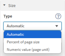
The Size Type setting controls how elements are sized on the report page and affects the positioning of subsequent elements:
|  |
Height
Depending on the element type and size type, height may be adjustable or automatically determined:
- Visualization Objects (e.g., charts, image-processed tables): Height can be set to a specific value.
- True Table Objects: Height automatically adjusts based on the number of rows.
- Line Elements: Height is controlled by thickness of the line.
- Text Elements: Expands vertically based on text content, the line break setting, and width.
- Table of Contents Element (TOC): Grows in height based on its content.
- Qlik Sheet Object: Always spans the full page height.
Only image-based elements allow a fixed height setting.
Spacing
Spacing defines the distance around an element (top, bottom, left, and right) to its neighboring elements. Elements in a report layout interact and complement one another, so adjusting spacing can significantly impact the overall design.
By default, spacing is set to 5 on all sides of an element, and the default Page Unit is millimeter.
The effect of spacing varies based on the selected size type:
- Automatic or Percent of Page Size: Spacing acts as padding, expanding inward without altering the element's overall dimensions on the report page (including the visible content and surrounding spacing). This affects the visual size of the element.
- Numeric: Spacing acts as a margin, expanding outward and increasing the element's total dimensions on the report page (including the visible content and surrounding spacing), which may shift neighboring elements to the right or downward.
Understanding Spacing Behavior
The difference in spacing behavior is intentional. With percentage-based sizes, designers don’t need to account for spacing when setting dimensions. For example, four elements can be evenly distributed across a report page by setting each to 25% width, while spacing adjustments won’t affect the layout. This is because percentage sizing considers the total space of the element.
In contrast, numeric values prioritize pixel-perfect accuracy, where the size reflects the exact dimensions on the report page, and spacing adds to the element's total space. This approach ensures precise sizing, but designers must account for all numeric values to achieve the desired layout.
Examples
The following examples illustrate how spacing can scale or shift elements. A visible border has been added to the elements to make the design clearer, which can be helpful when designing the report. The left-side images show the symbolic design, while the right-side images present a screenshot from the Preview Window, displaying the actual PDF preview of the ancoreShare report.
Example 1: No Spacing
The images below show elements with no spacing applied. Both elements have their spacing set to 0, resulting in no padding or margin around them. In this case, the size setting is not impacting the behavior of the spacing.
Design | Report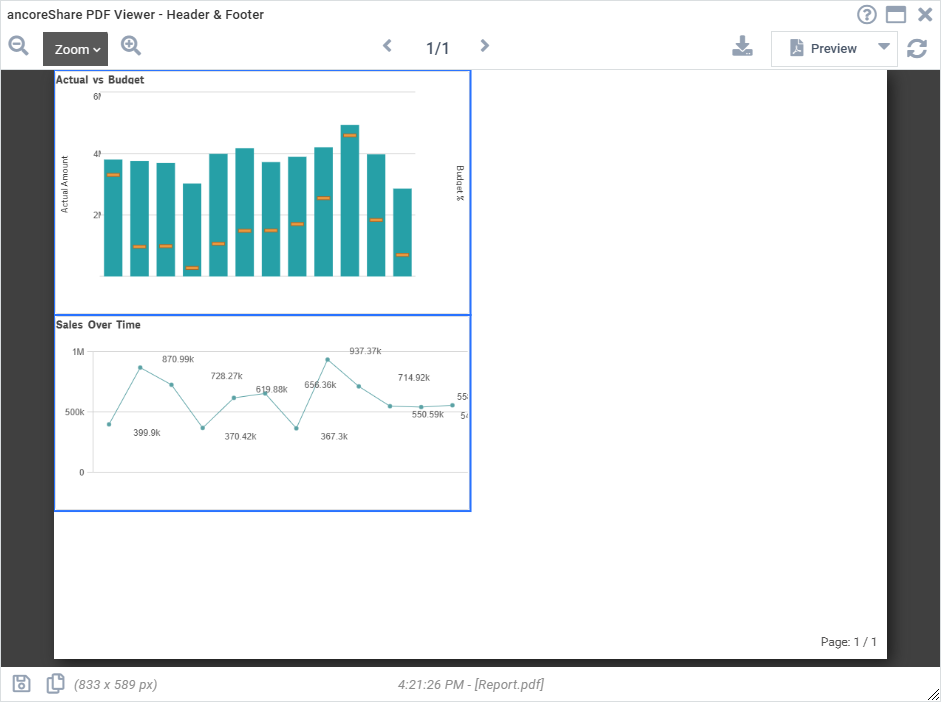 |
Example 2: Size in Percentage, with Spacing Acting as Padding
In this example, the Size Type for both elements is set to "Percent of page size," with size values specified as 50% of the page width and 40% of the page height. Spacing values of 20 are only applied to the second element's top and left, causing the spacing to act as padding and the content to scale inward according to these settings. The first element remains set to spacing 0.
You can see in the images that, despite both elements having the same size settings, the spacing affects the visual size of the second element in this case.
Design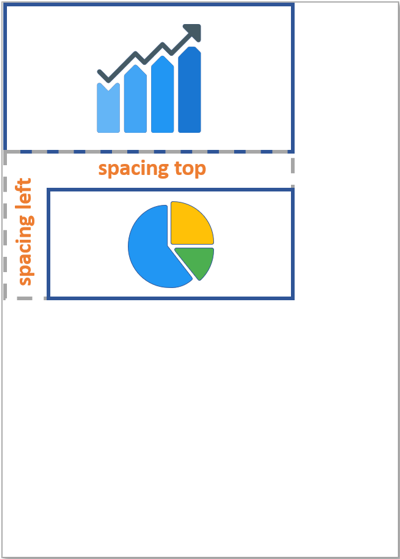 | Report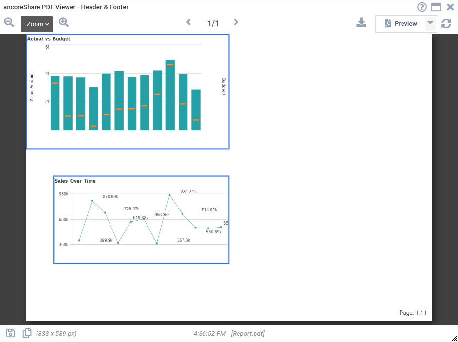 |
Example 3: Size in Numeric Values, with Spacing Acting as Margin
In this example, both elements have their Size Type set to "Numeric," with size values of 150 for width and 80 for height, which are approximately the same as the percentage size used in Example 2. The spacing values of 20 are applied only to the second element's top and left. This causes the spacing to act as a margin, expanding outward from the second element and potentially shifting neighboring elements to the right or downward. The first element remains set to spacing 0.
You can see in the images that, in this case, the spacing affects the position of the second element, which extends further to the right and down on the page.
Design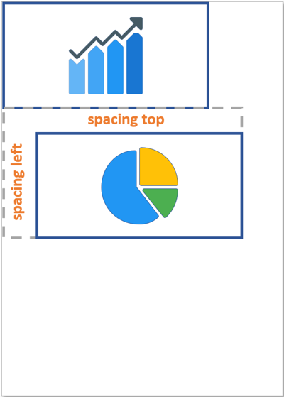 | Report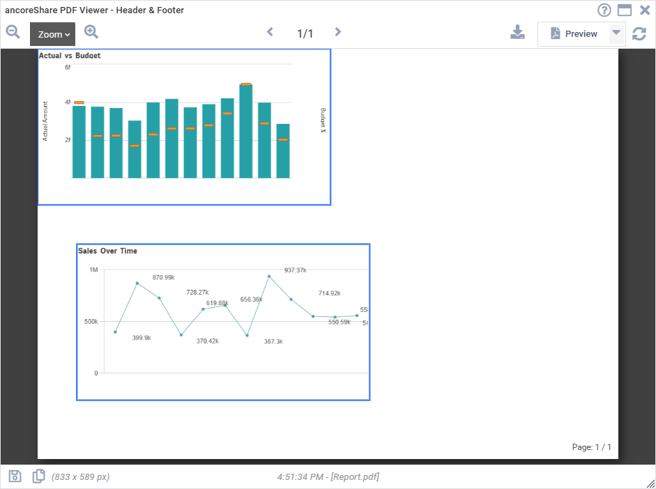 |
Other Position Settings
In addition to the key settings - Anchor, Size, and Spacing - several other settings can impact the position of an element on the report.
Body and HeaderThe region setting specifies whether an element appears in the body or the header/footer of the report. Elements set to "Header" (except true table objects) will repeat on each page thereafter, starting from the page where the element was first added. You can also design footers by combining this setting with a margin offset, utilizing the Size and Spacing settings as described in the Spacing section. This can be paired with Page Numbers for added functionality. Alignment (see below) applies within the header/footer region as well. | 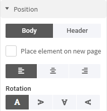 |
Print On New Page
When enabled, this setting forces the element to start on a new page.
Alignment
Alignment determines the horizontal position of an element based on the total page width, independent of other elements.
Rotation
The Rotation setting allows you to rotate the element, but note that the size values displayed in the properties panel (width and height) remain unchanged.
For example, if an element has a width of 100 and a height of 50, rotating it 90° clockwise will make it appear as 50 wide and 100 high on the report page. However, the size settings in the menu will still show a width of 100 and a height of 50. This means the reported values don't update with the visual change, which can affect the positioning of other elements and needs to be considered in the overall layout.
The reason for keeping the original size values is to avoid requiring users to manually adjust all size settings when rotating an element.
Examples
As noted earlier, the Anchor, Size, Spacing, and other positioning settings work together to help you achieve all your design needs for the report. The following examples range from simple to more complex layouts, demonstrating how these settings can be used for various design possibilities, such as creating footers with page numbers. Additional examples may be added over time to further illustrate different use cases.
Example 1
How to place two visualization elements side by side, evenly distributed across the page horizontally.
Element 1
| Element 2
|
Design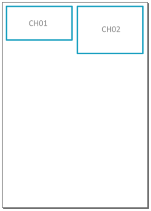 | Report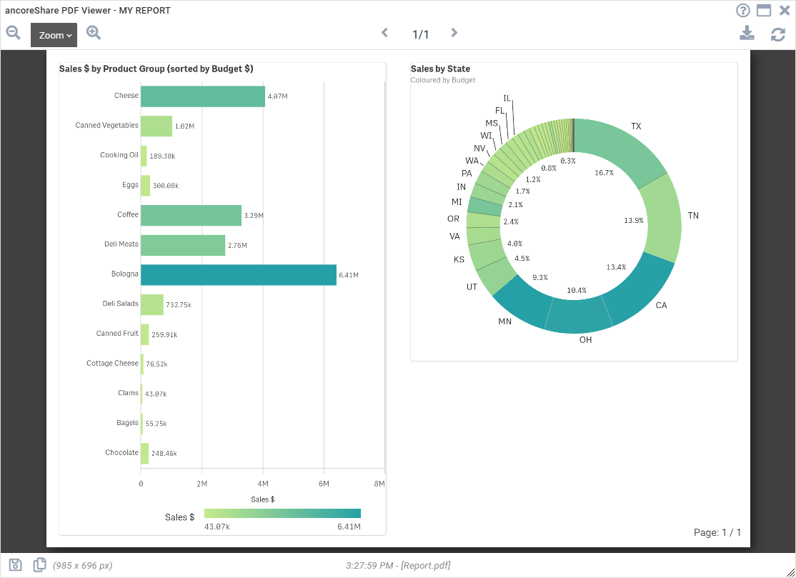 |
Example 2
How to place three visualization elements side by side, evenly distributed across the page, and align them at the bottom by adding top margins for smaller elements.
In this case, it was achieved by using percentage values for the size, with spacing acting as padding for the smaller elements. The same result could be accomplished with numeric size values, where spacing acts as a margin. However, in that scenario, the height value in the size settings would need to account for the spacing to match the total height of the larger element without spacing.
Element 1
| Element 2
| Element 3
|
Design | Report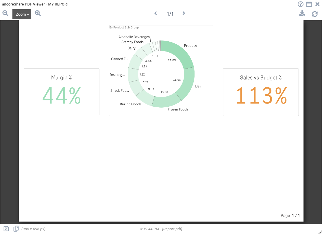 |
Example 3 - Header
How to create a header that repeats on each page of the report - This example consists of six elements: an image, title, subtitle, logo, a separating line, and a table:
In the header, the image (chart object) is positioned on the left, followed by the title and subtitle (two separate text elements) in the center. A logo (also a chart object) is placed on the right, and a line (line element) is added beneath all these elements to visually separate the header from the body content.
Additionally, a simple true table element (table object) is included in the body section of the report, spanning multiple pages. This demonstrates how the header is consistently repeated across all pages.
Below is a table showing the settings applied for each element, followed by screenshots of the design and the resulting output, where the repeating header can be seen on each page.
| Element 1 - Qlik Object ("Text & Image")
| Element 2 - Text
| Element 3 - Text
|
| Element 4 - Qlik Object ("Text & Image")
| Element 5 - Line
| Element 6 - Table
|
Design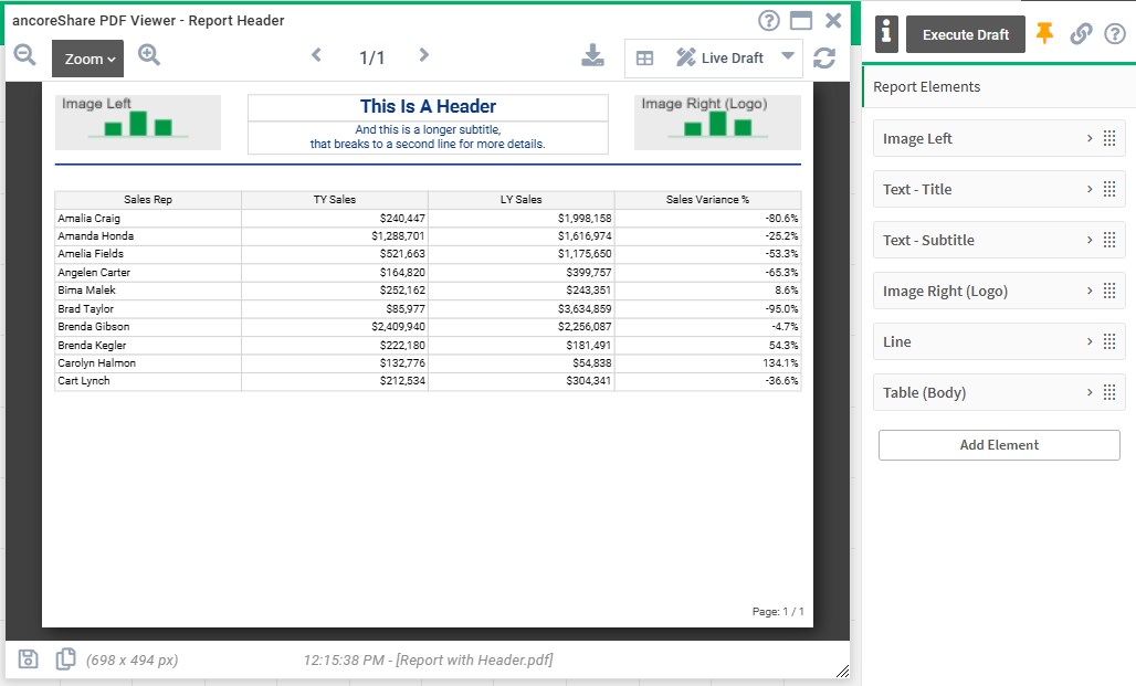 | Report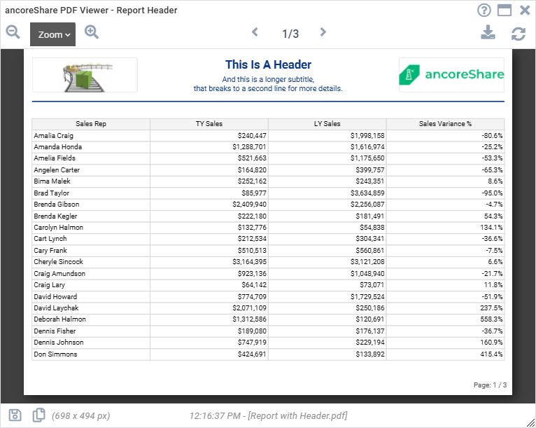 |
Example 4 - Footer with Page Numbers
How to create a footer with page numbers that repeats on each page of the report - This example includes three elements: a logo image, page numbers, and a table element:
The logo (chart object) is positioned in the footer region and will appear at the bottom of each report page. The page numbers, configured as a special element in the Report and Page Settings (rather than within the Report Elements section), will also repeat on every page. For more details on configuring page numbers, see the full article on Page Numbers.
A simple true table (table object) element is placed in the body section of the report, spanning multiple pages. This demonstrates how the footer and its contents repeat consistently across all pages as the content extends.
Below is a table showing the settings applied for each element, followed by screenshots of the design and the resulting output in a browser PDF viewer, where the repeated footer is visible on every page.
Element 1, Footer - Qlik Object ("Text & Image")
| Element 2, Body - Table
|
Additional Element, Footer - Page Numbers
| |
Design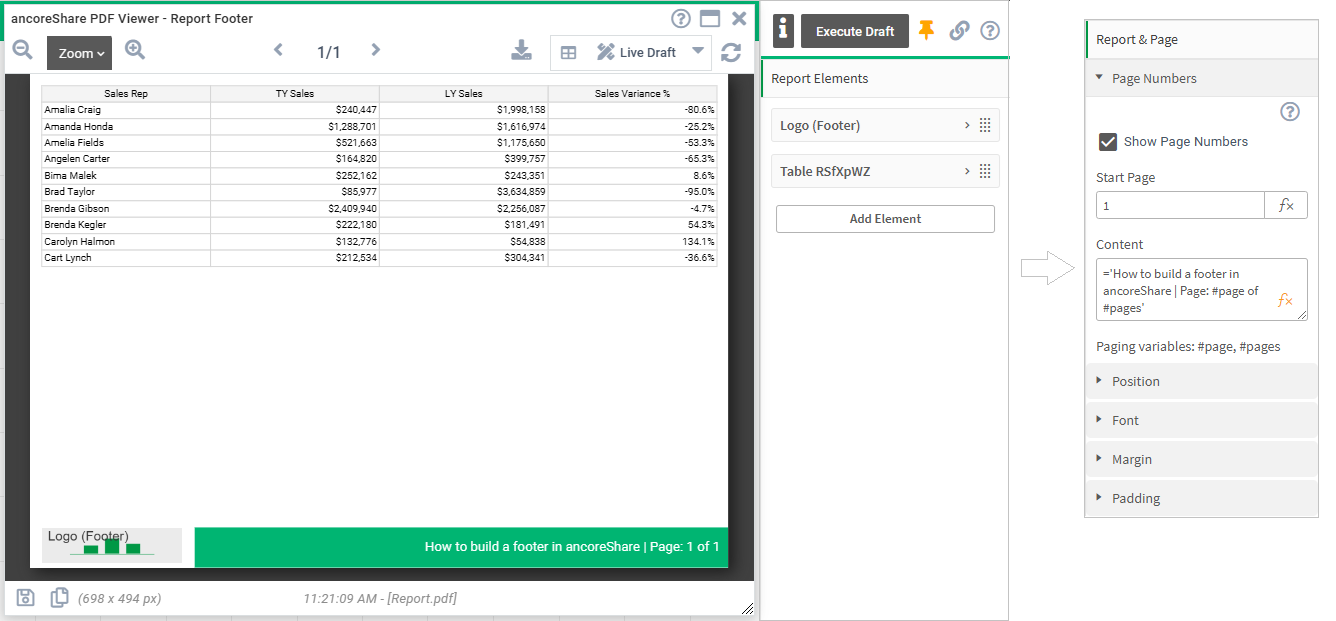 | Report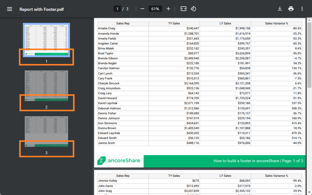 |
Next Steps:
- Proceed with designing Report Elements
- Learn more about Report and Page Settings
- Or have a look on how and where to Share and Export your report