Intro
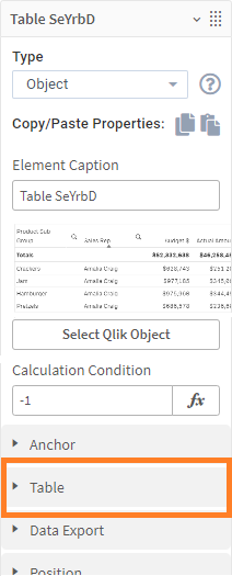
ancoreShare Extension provides an extensive list of properties that enable you to design pixel-perfect tables. The comprehensive table properties allow you to precisely specify styling for each column and cell to control how the table renders on your report. On the Properties panel, click Table and define the following properties:
|  |
General Table Settings
Here you can set some basic properties for your table object.
Process table as imageSelect this option to add the table as an image on the report. Though a high-resolution image of the table is rendered on the report, it limits the number of rows on the report. You will only see the data displayed on your sheet, and the scrolling area is not captured. For example, if there are 200 rows in your table, out of which only 15 are displayed on your sheet; then the report will have only those 15 rows, and the rest will be clipped out. Further, you will not be able to copy data from the image. |  |
True Tables Only The now following settings only appear, if the above setting Process Table as Image is disabled. | |
First Page Top PositionHere, you can specify the spacing from the top where the table starts on the report page. The spacing is calculated in the page size unit specified in Page settings. This value overrides the Top setting in Spacing for the page on which the table starts. Note that if the table spans over several pages, all pages except the first one will have the top spacing set as mentioned here. Refer to the Qlik documentation to know more about expressions. | 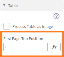 |
Automatic Cell WidthUse the options here to control the width of the table columns. You can choose to distribute width evenly or according to the content. By default, the distribute width evenly option is selected, and all columns have the same width. If you choose the Content option, the column width is adjusted to accommodate the content. Note There are no height settings for the tables as it is generated automatically according to the amount of data, number of rows, and other formatting properties such as cell padding, font size, etc. You will see height settings only if you have selected the Process Table as Image option. | 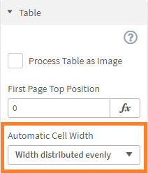 |
Set Column styleThis button shows the properties to specify conditions that will govern the table headers, totals rows, or columns. To quickly learn how to work with these properties, see the article Styling columns. | 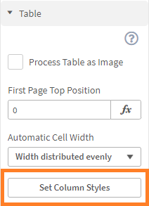 |
Table Properties | |
Table header styleThe following settings only apply to table headers.
|  |
Row heightTable rows automatically grow in height, depending on their cell content and the the Content Overflow setting. However, this feature allows to set a minimum height for headers independently from this. This setting is particularly useful when working with images as cell content, as the row height cannot adapt to the image size. Learn more about this in article Column Styles (Images in table cells). |  |
Total row styleSpecify a Fill Color and a Font Color just for the total rows of this table. | 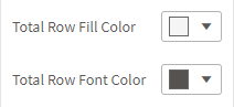 |
Custom number delimitersYou can control how the grouping (thousands) separators and the decimal separator are displayed on the tables. Optionally, specify a symbol or text for Empty values. This symbol or text will be displayed in case cell values are empty. | 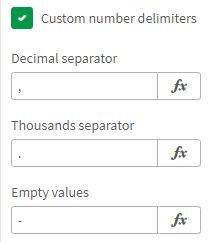 |
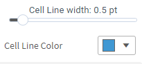
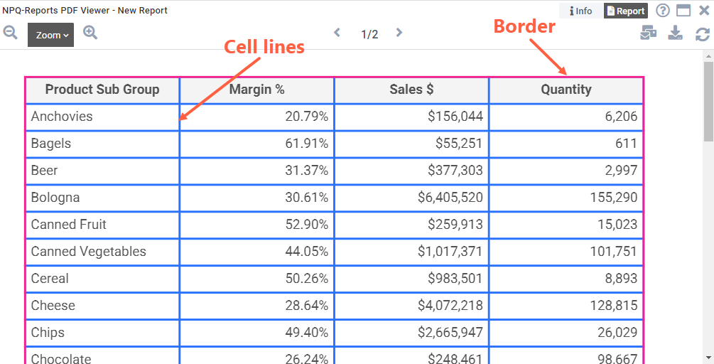
Cell line styleCell lines are all the lines inside the table and the ones that form the outer body of the table. The border forms an outline of the table element. Here's an example showing the cell lines in Blue and the border in Pink.
|  |
Next Steps
- Learn about the Styling Columns editor
- Or go back to Qlik Object - Tables for a more detailed overview