Intro
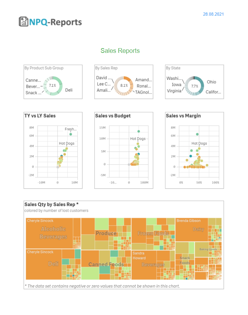
ancoreShare Server offers a very intuitive UI that lets you add multiple Qlik objects, from various sources, in a single report. In addition, it comes with numerous formatting options and support for condition-based styling to help you design visually appealing reports just the way you want them. Here's a sample HTML export showing a report with multiple chart objects. For ancoreShare, all Sense visualizations except tables are categorized under charts and treated as images. Therefore it comes with several options to set the resolution and the image quality. As a result, all the objects are rendered as high-quality pictures. You can use the steps mentioned in this section to work with all Sense charts such as Bar charts, Scatter plots, Maps, Gauges, KPI charts, and so on. You can also add a Text & Image object to your report this way, e.g., to display your logo on the report. NPQ-Reports allows you to add true data-driven tables with selectable text content. You can also add your tables as images. However, when adding tables as images, they also act as charts; therefore, please read this section to learn how to render tables as images. See the Tables section to learn about the differences and advantages of using true data-driven tables and the various settings and styling options. |
|
This section provides information on how to work with chart objects.
- To see how your report comes out, use the Export options available on the toolbar to generate a report.
- You can also use general computer commands for saving Ctrl+S, undo Ctrl+Z, copy Ctrl+C, and so on.
Basic Settings
Add and select a chart object and configure the element properties.
You can dynamically switch between all kind of charts and visualizations and therefore set the properties for the same report object in ancoreShare for chart and table objects.
This also ensures proper display of objects, even if the object type would be changed in the Qlik source app.
Adding chart objectTo add a chart object to your report, drag the Qlik icon onto your report designer sheet.You will see a gray placeholder for the object. | 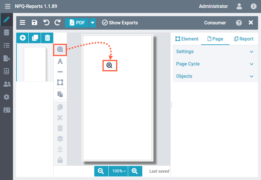 |
Selecting chart objectIf selected, the Settings bar on the right displays the available element settings for the object. Qlik SourceSelect the Qlik Source from the drop-down list. You will see only those sources that are specified in your Report Record Settings. Qlik ObjectIf Load Metadata was executed for this source, you will see a list box with thumbnails of all objects from that source, where you can select one. Alternatively, start typing object ID, chart type, or the title of the object in the field Qlik Objects, to filter the suggestions in the box. Those suggestions in the box are only a snapshot of the time when loading the metadata. It's a feature for convenience when designing a report. At any time you can just straightly set the Qlik ID of an object from that source here. If this ID exists at the time of exporting the report, it will be processed properly. You can also set the ID of a Qlik object dynamically by using Qlik expressions. Begin with typing an "=" if you want to do so. Load Metadata of Source To ensure a convenient workflow for report designers, the metadata of sources connected to a report should be reloaded regularly, when changes in the Qlik app happen. | 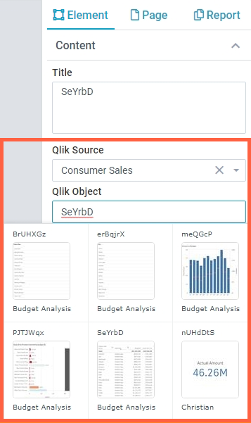 |
Chart TitleWhen you add a chart object, the Qlik ID of the chart is automatically populated as the Title. Here's an example showing how the title is reflected on your report designer. NOTE: The title is only displayed in the designer to help you quickly find your objects and will not be displayed in the exported report. | 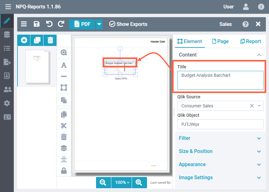 |
Link URLThe Link URL field allows you to add a link to the chart object. When the report is generated, the URL is embedded in it. Clicking the object image on the report redirects the users to the URL specified here. Setting a link is particularly useful when you want users to access the live view of the object in the Qlik environment. | 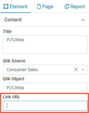 |
Filtering chart dataUsing the Filter settings, you can restrict, reduce and focus the data that you want to show on your report, from the Qlik application. To access filter settings for chart objects, perform the following steps.
Top and ParetoThis setting is only available for QlikView sources. It lets you conveniently order and sort the values of a field. Alternatively you can do the same with Qlik expressions for Sense sources in a regular filter above. | 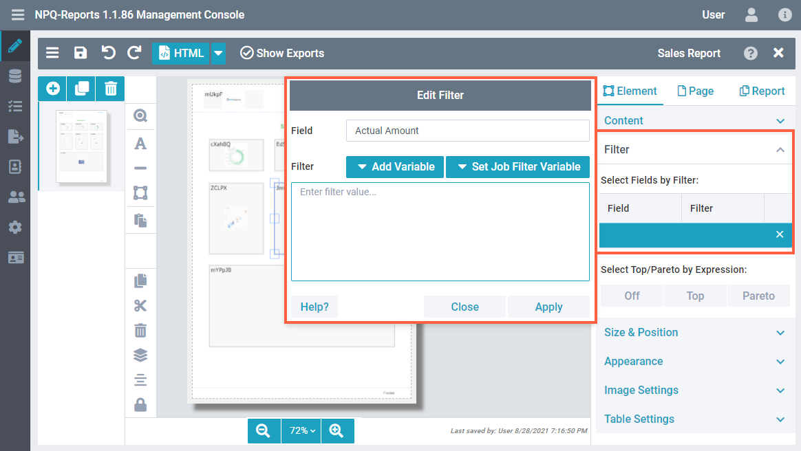 |
Size and Position
As you must have seen by now, the graphical user interface is highly intuitive. You can quickly drag, drop, resize, and order your elements on the report. However, for further precision, the system also offers absolute control over sizing and positioning using numeric values to easily create pixel-perfect reports.
When sizing and positioning elements using mouse drag operations, you will also see design guides (shown as green lines in the image) to help you with correct placement. For charts, you have the following options available: PositionThe chart position defines its distance from the white space on the designer sheet. The position settings specified here are calculated in addition to the Page Margin specified in the Page Settings. For example, if you have specified the page margin as 5, and the left margin as 15, then the chart would be placed at 20 from the left edge of the page, as shown in the image.
The Fixed option is not the same as the Lock provided on the Toolbar.
NOTE: If you have enabled the Header on the Page Settings and your object touches inside the header area, it will be repeated on each report page. SizeYou can specify the chart size using:
RotationSpecifies the angular placement of the element on the report page. | .png) 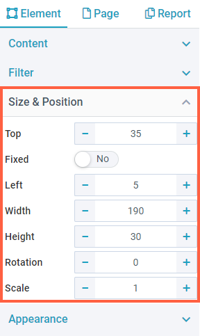 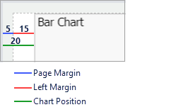 |
ScaleScale specifies the content resolution of a chart element. For example, if you have set the scale as 2, the chart scales twice in size, showing a more detailed view. The text gets smaller with an increase in scale, but as this is still a dynamic web object at the time the image is taken in Qlik, it adjusts on the container automatically, and therefore, may display more details. Scaling is not zooming It does not increase the size of the chart as an element. Instead, it increases or decreases the scale of the image while maintaining its aspect ratio of the size you set for it. See the image showing an example on the right to know how it works. | 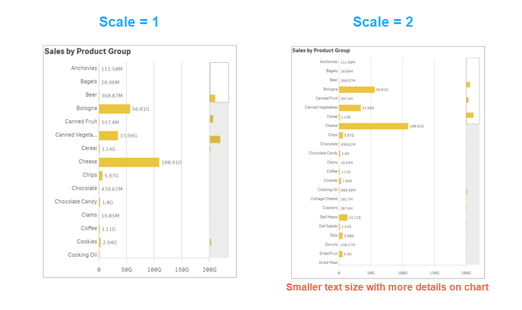 |
AppearanceAs the name suggests, the Appearance settings allow you to define how the chart elements look.
| 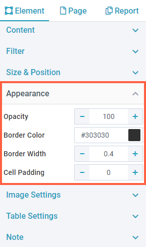 |
Image Settings
All the chart visualizations can be rendered as exceptionally good quality high-resolution images on your ancoreShare report. You can further control the level of processing quality using the settings here.
Image ProcessingUse the settings here to define Image Processing or the dpi (dots per inch) settings for chart images. For Image Processor, you can select between any of the following two methods:
| 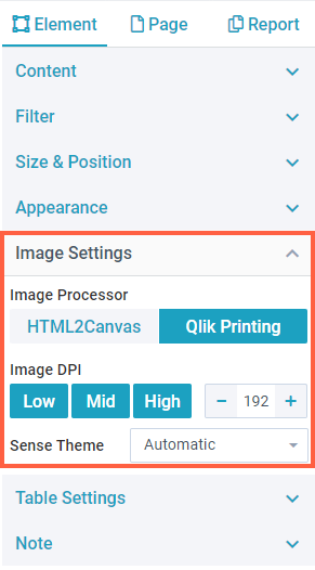 |
Sense ThemeQlik Sense comes with certain themes which you can choose for exporting Qlik objects (Sense Classic, Sense Focus, Sense Breeze, and Qlik Horizon). This is only applicable to chart elements. NOTE: The chart thumbnail on the report designer may continue to show the default theme. However, the generated report will contain charts in the theme specified here. | .png) |
NoteYou can add Notes to your chart objects on PDF and PPTX exports to provide additional information to your users. For example, you can add notes for commenting on something, drawing attention to a specific area in the report, taking a note for yourself, giving some context for colleagues, adding information that is not in the title or legend of the chart, and so on. To add a note:
For PDF reports, notes are exported as actual annotations in the PDF file. Users with sufficient privileges can further edit them, enabling active collaboration. The appearance of notes depends on the PDF viewer being used. For example, PDFs displayed on web browsers may appear different from what they appear in the Acrobat Reader. In the case of PPTX exports, the notes are shown in the notes area at the bottom of each slide. As the PPTX does not show notes directly on elements, all the notes are shown collectively at the bottom, if you have several elements with notes on one page. It is recommended to use Titles for notes to segregate them for each element. | 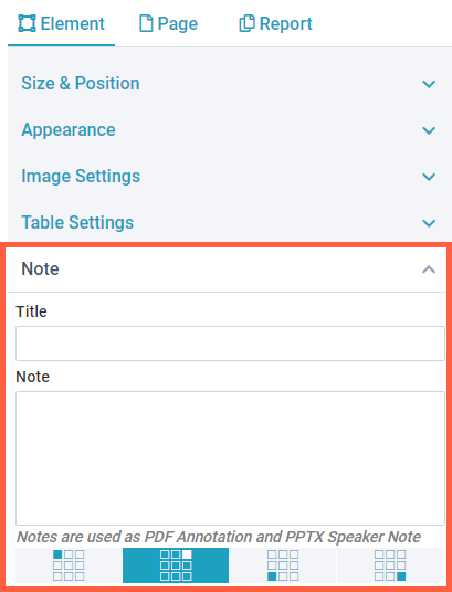 |
Next Steps:
- Now add Tables, Text, or Lines and Rectangles to your report