Intro
The following describes all properties of the table element's menu box, except for the table and styling options. You can refer to them in the next article Table Styling or go back to Basic Settings for a start. In Qlik Object - Tables you can find a more detailed overview of all the table element settings.
Element Properties
AnchorIf there is another existing element on your sheet that comes before in order, you will see an Anchor tab. This setting defines the relative position of elements on the report page. Drag the orange box "B" to set the position of this table with respect to the preceding element "A" or choose an anchor position from the drop-down list above. To learn more about how all the positioning and sizing settings work together and affect each other and how to precisely position the elements on your report by combining them, go to Positioning and Sizing elements. If your element is within a cycle section, please refer to details in Positioning elements within a Cycle. | .png) |
Data ExportData forms the base of all the insights derived from your reports. You may want to use the data shown in your reports elsewhere for calculations or as a source for some other tools or reports like in your Excel environment. Using the Data Export feature, you can enable the extraction of pure data out of all the Table elements in your report in form of Excel or CSV files. Learn all about this feature in article Data Export. No Formatting Data exports do not consider any table formatting. | 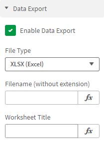 |
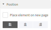
PositionClick the Position tab to define general position settings for the table object on your report.
|  |
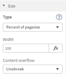
SizeClick the Size tab to set the type and width of the table size on your report and the content overflow behavior of the text. TypeHere, you can choose any of the following options:
NOTE: There are no height settings for the tables as it is generated automatically according to the amount of data, number of rows, and other settings such as cell padding, font size, etc. You will see height settings only if you have selected the Process Table as Image option. Content OverflowSpecify how the text content is rendered in case it overflows the table cell. Choose from any of the following:
|  |
Scale and Page BreakIf the setting Process Table as Image is enabled, you will see no Content Overflow setting, but instead Scale and Page Break. Go to article Charts to learn all about these settings. | 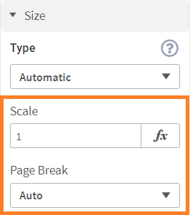 |
SpacingClick the Spacing tab to define the distance of the table from neighboring elements on your report. You can do this separately for Left, Right, Top, and Bottom. The behavior of spacing depends on the selected size type.
To learn more about how all the positioning and sizing settings work together and affect each other and how to precisely position the elements on your report by combining them, go to Positioning and Sizing elements. | .png) |
FontsClick the Font tab to specify the font properties of the table object.
| .png) |
Cell paddingClick the Cell Padding tab to define the distance of table content from the cell lines inside the table. Enter the padding value for Left, Right, Top, and Bottom. Optionally, provide an expression for specifying conditional padding value. NOTE: The cell padding value is always specified in points. | 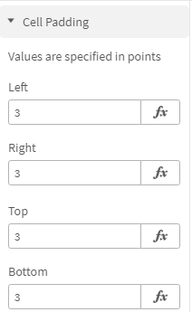 |
BorderClick the border tab to add a border around your table. Borders are particularly useful when you have multiple elements, as they present a clear picture of what element takes how much space. Once you have this visibility, you can easily decide the size and margin for elements. | 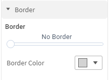 |
Image QualityClick the Image Quality button to define Image Processing, the dpi (dots per inch) settings, and Image Compression. Only as image Those settings are only available, if the option Process Table as Image is enabled in the table settings. | |
For Image Processing, you can select between two methods, Detailed and Fast:
Low quality in edit mode While you are working in Edit mode, the report output will always show you the image quality in Fast mode. To view the actual quality, you need to click Done Editing on your Sense sheet and then refresh your preview window or trigger the ancoreShare button there. | 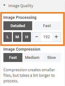 |
For Image Compression level, you can choose from Fast, Medium, or Slow options. The Fast mode produces bigger file sizes and the Slow mode produces smaller file sizes. Note Compression does not impact the image quality, only the file size. As compression is an additional step when creating the report, it takes a little longer to process it. | 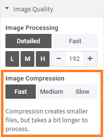 |
NoteIf you have selected the Process Table as Image option, you will see a Notes segment in the properties panel. You can add notes to your table objects to provide additional information to your users. For example, you can add notes for commenting on something, drawing attention to a specific area in the report, taking a note for yourself, giving some context to colleagues, adding information that is not in the title or legend of the chart, and so on. To add a note:
If you generate a PDF report, then the notes are exported as actual annotations in the PDF file. Users with sufficient privileges can further edit them too, which enables active collaboration. In the case of PPTX exports, the notes are shown in the Notes area at the bottom of each slide. As the PPTX does not show notes on objects, all the notes are shown collectively at the bottom. It is recommended to use Titles for notes to segregate them for each element. No note in Preview Window You will not be able to see or click the note in the Preview window. Download a draft report to verify the correct working of your note. Only as image This setting is only available, if the option Process Table as Image is enabled in the table settings. | 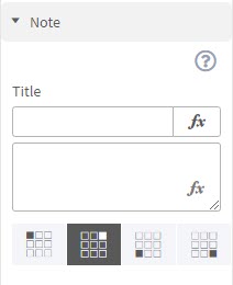 Sample PDF with Notes 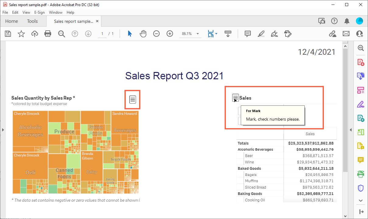 Sample PPT with Notes 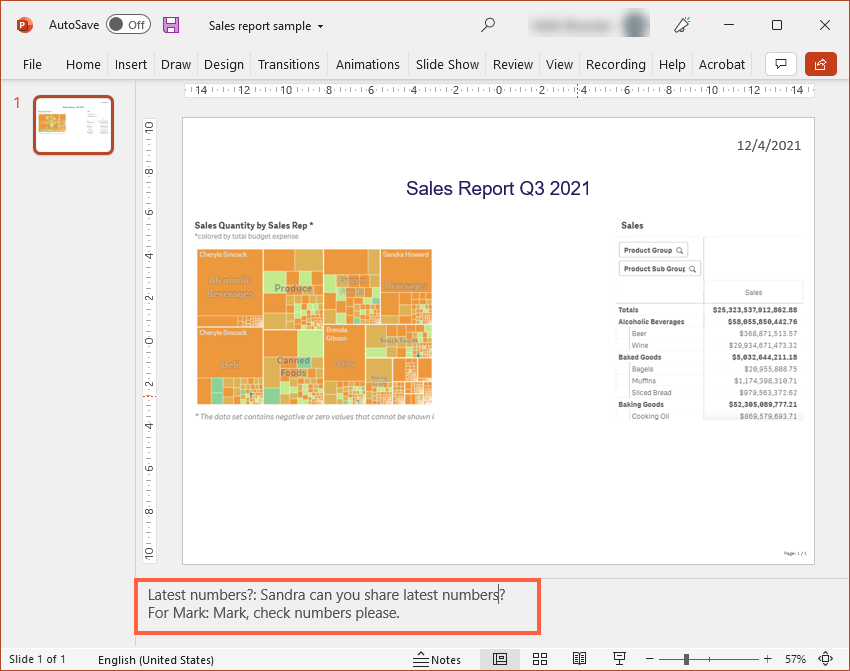 |
TOC Table of ContentsIf you added a TOC element to your report, you can choose for each other element, if it should appear in the table of contents or not. This might be useful to disable headers or paragraphs. You might also go for only enabling the header in the TOC instead of each object. The following settings are available in this section:
Not for Header Elements These TOC settings are only visible, if the element is assigned to the Body of the report (default), not if it's in the Header. You can change this within your element's menu box under Position. | 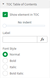 |
EventsWith the help of a little JavaScript you can create On Before Element events for making selections or setting bookmarks in your app, based on an individual element. If you are familiar with JavaScript and the Qlik API, have a look at the fx Expression Editor of this setting to see examples and code snippets. | 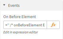 |
Next Steps
- Proceed with Table Styling options
- Or go back to Qlik Object - Tables for a more detailed overview